Back to Journal
TechnologyJuly 22, 20263 min read

Why Your Business Needs a Mobile-First Strategy

Webotixs Team
Technical Authors
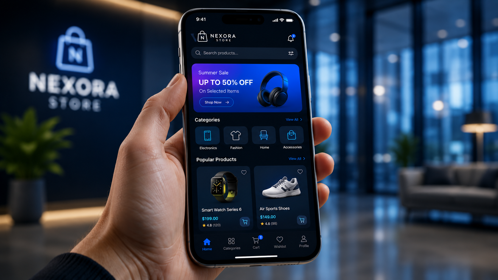
Why Your Business Needs a Mobile-First Strategy

With over 60% of web traffic coming from mobile devices, a mobile-first approach is no longer optional for growth.

Introduction: The Mobile Revolution in Digital Business

Over the past few years, the way users interact with the internet has fundamentally shifted. Mobile phones, tablets, and portable devices are no longer secondary browsing channels—they are the primary gateway to the digital world. With over 60% of total global web traffic originating from mobile devices, traditional desktop-first design is officially obsolete.

For businesses operating in competitive markets across the USA, Canada, UK, and Australia, adopting a mobile-first strategy is no longer just an optional upgrade; it is an absolute necessity for survival and growth. At Webotixs, we build high-performance digital architectures that ensure your brand delivers a flawless experience, regardless of the screen size.

What is a Mobile-First Strategy?

A mobile-first strategy means designing and developing a website or digital platform starting from the smallest screen (smartphones) and scaling up to larger desktop monitors.

  • Prioritized Content: Focusing strictly on core messaging, essential features, and high-value call-to-actions that fit comfortably on a mobile screen.

  • Streamlined Performance: Ensuring code efficiency, compressed imagery, and lightning-fast loading speeds for mobile network constraints.

  • Thumb-Friendly Navigation: Designing interactive elements, menus, and forms that are effortless to operate using one hand.

Why Desktop-First Design is Failing Businesses

Historically, websites were built for large desktop screens and then "shrunk down" for mobile phones using responsive design tricks. Today, this approach introduces critical flaws:

  • Bloated Codebases: Desktop elements hidden on mobile still load in the background, drastically slowing down mobile page speeds.

  • Poor User Experience: Cluttered layouts, hard-to-read fonts, and tiny buttons frustrate users, resulting in soaring bounce rates.

  • Lost Conversions: If a potential customer struggles to navigate your site on their phone within the first three seconds, they will immediately bounce to a competitor.

Core Benefits of a Mobile-First Approach

1. Superior Search Engine Optimization (SEO) & Google Ranking

Search engines like Google utilize Mobile-First Indexing, meaning the mobile version of your website is evaluated as the primary version for search rankings. A mobile-optimized site naturally achieves higher visibility, improved domain authority, and better organic traffic.

2. Drastically Lower Bounce Rates and Higher Engagement

When a website loads instantly and adapts fluidly to a smartphone screen, visitors stay longer. Engaging mobile layouts keep potential clients hooked, increasing the likelihood of form submissions, purchases, and inquiries.

3. Maximized Conversion Rates and Local Lead Generation

Most high-intent searches—such as finding local services, booking appointments, or checking e-commerce products—happen on mobile devices. Features like click-to-call buttons, mobile wallets, and streamlined checkout flows turn casual mobile visitors into paying customers instantly.

Frequently Asked Questions (FAQ)

Q: What does "mobile-first" actually mean for my business website?

A: It means your website is conceptualized, designed, and optimized specifically for smartphone users first, ensuring maximum speed, readability, and conversion capability before scaling for desktops.

Q: Does mobile-first design negatively impact desktop users?

A: Not at all! A mobile-first website scales up fluidly, providing desktop users with a clean, modern, and lightning-fast browsing experience as well.

Q: How does Webotixs approach mobile-first development?

A: At Webotixs, we engineer custom, high-performance web solutions centered around responsive architecture, fast load times, and conversion-focused mobile UX to maximize your business growth.

Conclusion: Future-Proof Your Brand with Webotixs

The mobile revolution is here, and businesses that fail to prioritize mobile users risk losing substantial market share. Transitioning to a mobile-first strategy ensures your brand remains accessible, credible, and competitive in an increasingly mobile-centric world.

Ready to overhaul your digital presence and capture mobile traffic effectively? Contact our expert team at Webotixs today for custom, results-driven web solutions tailored to your business goals!

#Webotixs#Web Development#Node.js#PostgreSQL#API Development#Backend Engineering#Software Architecture