Why Your Website Looks Great But Still Doesn't Convert in 2026
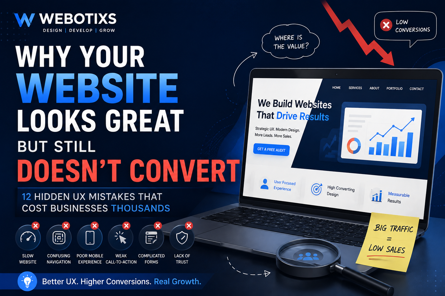
Discover the hidden UX mistakes that reduce conversions and learn proven strategies to improve user experience, increase leads, and grow your business.
Why Your Website Looks Great But Still Doesn't Convert
Imagine investing thousands of dollars into a professionally designed website. The colors are modern, the animations are smooth, the typography is elegant, and everyone compliments how beautiful it looks. Yet weeks pass, traffic continues to grow, and sales remain disappointingly flat. Sound familiar?
This is one of the most common challenges businesses face today. A visually appealing website is no longer enough to generate leads or increase revenue. While aesthetics help create a strong first impression, they represent only one piece of a much larger puzzle. Visitors don't convert because a website is attractive. They convert because it makes their journey effortless, answers their questions quickly, builds trust, and guides them toward taking action.
Whether you run an eCommerce store, a SaaS company, a local service business, or a global startup, your website functions as your digital salesperson. Unlike a human sales representative, however, your website has only a few seconds to convince visitors that they are in the right place. Every confusing menu, slow-loading page, unclear headline, or weak call-to-action quietly pushes potential customers toward a competitor.
This is where User Experience (UX) becomes the deciding factor. Great UX removes friction, simplifies decision-making, and creates confidence. It ensures that every interaction moves visitors closer to becoming customers rather than giving them reasons to leave.
In this comprehensive guide, we'll explore 12 hidden UX mistakes that silently reduce conversion rates and explain practical strategies to fix each one. By the end, you'll understand how to transform your website from a digital brochure into a powerful business growth tool.
Why Beautiful Websites Still Fail
Many businesses mistakenly believe that attractive visuals automatically create successful websites. While modern design builds credibility, it doesn't guarantee results. Think about walking into a luxury hotel with a stunning lobby but confusing signage, slow service, and difficult check-in procedures. The elegant décor quickly loses its impact because the overall experience feels frustrating.
Websites work exactly the same way.
Visitors arrive with specific goals. They want answers, solutions, products, or services. If they struggle to understand what you offer or how to proceed, they'll leave regardless of how impressive your design appears.
Successful websites balance visual design with strategic functionality. Every section exists for a purpose. Headlines communicate value immediately. Navigation feels intuitive. Calls-to-action are impossible to miss. Content answers important questions before users even ask them. Trust signals eliminate uncertainty. The entire experience feels smooth, predictable, and effortless.
When businesses focus exclusively on aesthetics, they often overlook these critical conversion factors. As a result, websites become visually impressive but commercially ineffective.
Hidden UX Mistake #1: Your Value Proposition Isn't Clear
The first question every visitor asks is simple:
"What does this business do, and why should I choose them?"
If your homepage fails to answer that question within the first few seconds, you've already lost many potential customers.
A vague headline like "Innovative Digital Solutions" sounds impressive but tells visitors almost nothing. Compare that with a clear, benefit-driven headline:
We Design High-Converting Websites That Generate More Leads and Sales for Growing Businesses.
The difference is dramatic. The second headline immediately explains the service, the outcome, and the target audience.
Your value proposition should include:
What you do
Who you help
What problem you solve
What makes you different
Why visitors should trust you
When these elements appear prominently in your hero section, users gain confidence and continue exploring your website.
Hidden UX Mistake #2: Too Many Choices
Psychologists have long observed that people become overwhelmed when presented with too many options. This phenomenon, often called choice overload, affects websites every day.
Imagine landing on a homepage that offers:
Book a Call
Contact Us
Get a Quote
Read the Blog
Download a Guide
View Portfolio
Subscribe
Watch Video
Learn More
Explore Services
Which button should visitors click?
Most choose none.
Instead of helping users make decisions, excessive options create hesitation.
High-converting websites prioritize one primary action per page. Secondary actions remain available but receive less visual emphasis.
For example, a service page might focus on one main CTA:
Book Your Free Website Strategy Call
Supporting links like "View Portfolio" can still exist, but they shouldn't compete for attention.
Reducing decision fatigue dramatically improves conversions because visitors know exactly what to do next.
Hidden UX Mistake #3: Your Hero Section Doesn't Sell
Your hero section is the most valuable real estate on your website.
Unfortunately, many businesses waste it with:
Generic stock photos
Vague marketing slogans
Animated backgrounds
Sliders
Long paragraphs
Multiple CTAs
Instead, your hero section should instantly communicate:
What You Do
One clear headline.
Who You Help
Identify your audience.
Why You're Different
Highlight your unique value.
What Happens Next
Present one compelling CTA.
A proven hero structure looks like this:
Headline
Build High-Converting Websites That Grow Your Business
Subheadline
Webotixs helps startups, service businesses, and eCommerce brands increase leads through strategic UI/UX design, SEO, and conversion optimization.
CTA
👉 Get a Free Website Audit
This format reduces confusion and immediately guides visitors toward taking action.
Hidden UX Mistake #4: Poor Mobile Experience
More than half of all website traffic comes from mobile devices. Yet many businesses still design primarily for desktop screens and treat mobile optimization as an afterthought.
Common mobile issues include:
Tiny buttons
Difficult navigation
Slow-loading images
Long forms
Text that's hard to read
Poor spacing
Pop-ups that cover content
A mobile-first approach ensures your website feels intuitive on every screen size.
Simple improvements include:
Larger tap targets
Responsive layouts
Compressed images
Shorter forms
Sticky CTAs
Readable typography
Faster loading speeds
Businesses that prioritize mobile UX consistently outperform competitors relying on desktop-focused designs.
Hidden UX Mistake #5: Slow Website Speed Is Driving Visitors Away
Your website has only a few moments to make a positive first impression. If pages load slowly, visitors often leave before they even see your content. Every second of delay creates friction, reduces trust, and lowers the likelihood of conversion. Businesses frequently invest in advertising and SEO to bring users to their websites, only to lose them because of poor performance.
Slow websites are usually caused by oversized images, unnecessary animations, excessive plugins, poor hosting, unoptimized code, and third-party scripts. While each issue may seem minor, together they create a frustrating experience that affects both users and search engine rankings.
Improving website speed doesn't always require rebuilding your site. Start by compressing images, enabling browser caching, minimizing CSS and JavaScript, using a Content Delivery Network (CDN), and choosing reliable hosting. Regularly test your site using tools like Google PageSpeed Insights to identify performance bottlenecks.
Fast websites don't just improve user satisfaction. They also strengthen SEO, increase engagement, and create a smoother buying journey.
Hidden UX Mistake #6: Confusing Navigation
Visitors should never have to guess where to click next. If your navigation is cluttered, inconsistent, or overloaded with options, users become frustrated and leave. A confusing menu is one of the quickest ways to lose potential customers.
Good navigation is simple and intuitive. Your primary menu should focus on the pages users care about most, such as Services, Portfolio, About, Blog, and Contact. Avoid using vague labels or creating menus with too many levels.
Navigation should also support your sales funnel. Guide users naturally from discovering your services to learning more, viewing case studies, and ultimately contacting your team.
Navigation Best Practices
Limit the main menu to essential pages.
Use descriptive labels.
Keep navigation consistent across all pages.
Add breadcrumbs where appropriate.
Include a search feature for larger websites.
Make navigation mobile-friendly.
A clear navigation structure improves both user experience and SEO by helping visitors and search engines understand your website.
Hidden UX Mistake #7: Weak Calls-to-Action
A visitor might enjoy your content and trust your business but still leave without converting if your call-to-action (CTA) isn't compelling.
Many websites rely on generic buttons like:
Learn More
Submit
Contact Us
Click Here
These CTAs fail to communicate value. Instead, use action-oriented language that explains exactly what users will gain.
Better CTA Examples
Get Your Free Website Audit
Book a Free UX Consultation
Request a Custom Proposal
Schedule Your Discovery Call
Improve My Website Today
Your CTA should stand out visually while remaining consistent with your brand. Use contrasting colors, generous spacing, and supportive text to draw attention without overwhelming users.
Position CTAs strategically throughout the page rather than only at the bottom. This gives visitors multiple opportunities to take action once they're ready.
Hidden UX Mistake #8: Missing Trust Signals
Trust is essential for online conversions. Visitors often hesitate because they don't know whether your business is credible. Strong trust signals reduce uncertainty and encourage users to move forward.
Effective Trust Signals
Client testimonials
Google Reviews
Case studies
Portfolio examples
Security badges
Industry certifications
Awards
Client logos
Years of experience
Team profiles
Whenever possible, include measurable outcomes. Instead of saying, "We build great websites," say:
"Helped a service business increase qualified leads by 42% after redesigning its website."
Specific results build confidence and demonstrate real expertise.
Hidden UX Mistake #9: Poor Contact Forms
Your contact form is often the final step before a visitor becomes a lead. If it's too long or confusing, many users will abandon it.
Common Form Mistakes
Asking for unnecessary information
Poor mobile usability
Generic error messages
Lack of privacy reassurance
No confirmation after submission
Form Optimization Tips
Request only essential information.
Use clear field labels.
Group related fields together.
Display inline validation.
Explain why you're collecting data.
Keep forms responsive on all devices.
Short, user-friendly forms consistently generate more inquiries than long, complicated ones.
Comparison Table: Poor UX vs. High-Converting UX
Website ElementPoor UXHigh-Converting UXHomepageGeneric messagingClear value propositionNavigationConfusing menusSimple, intuitive navigationWebsite SpeedSlow loadingFast and responsiveMobile ExperienceDifficult to useMobile-first designCTAGeneric buttonsBenefit-driven CTAsFormsLong and frustratingShort and optimizedTrustFew credibility signalsReviews, testimonials, and case studiesContentWalls of textWell-structured, scannable content
Actionable UX Improvements You Can Make Today
You don't need a full redesign to improve conversions. Start with these practical changes:
Rewrite your homepage headline to clearly communicate your value.
Reduce the number of CTAs competing for attention.
Improve page speed by optimizing images and scripts.
Simplify your navigation menu.
Add customer testimonials and case studies.
Make your primary CTA more prominent.
Shorten your contact form.
Review your website on multiple mobile devices.
Improve typography for better readability.
Monitor user behavior using analytics and heatmaps.
These incremental improvements often produce measurable gains without requiring a complete rebuild.
Why UX and SEO Work Together
SEO brings visitors to your website. UX determines whether they stay and convert.
A well-designed website helps users find information quickly, reduces bounce rates, and encourages deeper engagement. Search engines reward these positive experiences because they indicate that your content satisfies user intent.
When planning your digital strategy, avoid treating SEO and UX as separate disciplines. Combining keyword-focused content with an intuitive user experience creates sustainable, long-term growth.
Hidden UX Mistake #10: Ignoring User Psychology
A website doesn't convert because it looks impressive. It converts because it understands how people make decisions.
Every visitor arrives with a question:
Can I trust this company?
Will this solve my problem?
Is it worth my time or money?
Why should I choose this business over a competitor?
Your website should answer these questions naturally through its design, content, and layout. Unfortunately, many businesses focus on visual trends while ignoring the psychology behind user behavior.
Use Psychological Triggers That Build Confidence
Successful websites use proven principles to guide users toward action without feeling pushy.
These include:
Social Proof: Showcase testimonials, reviews, and client success stories.
Authority: Highlight certifications, awards, years of experience, and notable clients.
Consistency: Maintain a uniform design, messaging, and branding across every page.
Clarity: Remove ambiguity so users always know what to do next.
Reciprocity: Offer valuable resources such as free website audits or downloadable guides before asking for a commitment.
When users feel confident and informed, they are much more likely to become customers.
Hidden UX Mistake #11: Making Decisions Without Data
One of the biggest mistakes businesses make is redesigning their websites based on assumptions rather than evidence.
Comments like:
"I think this button should be blue."
"Our competitor has this layout."
"I don't like the homepage."
are opinions, not insights.
Instead, use data to understand how real users interact with your website.
Essential UX Analytics Tools
Google Analytics 4 (GA4)
Microsoft Clarity
Hotjar
Google Search Console
PageSpeed Insights
A/B Testing Platforms
These tools reveal valuable information, such as:
Which pages have the highest bounce rates.
Where users stop scrolling.
Which buttons receive the most clicks.
How visitors navigate your website.
Which devices experience the most friction.
By analyzing this data, you can prioritize improvements that have the greatest impact on conversions instead of making cosmetic changes.
Hidden UX Mistake #12: Using Outdated Design Patterns
Digital expectations change quickly. A website that looked modern three years ago may now feel dated, even if all the information is accurate.
Outdated design patterns reduce trust because users often associate old interfaces with neglected businesses.
Signs Your Website Needs a Redesign
The design looks inconsistent across pages.
It isn't fully responsive on mobile devices.
Page speed is slow.
Navigation feels complicated.
Branding is outdated.
Calls-to-action are difficult to find.
Accessibility has been overlooked.
Forms are long and difficult to complete.
Content hasn't been updated in months.
Your competitors provide a noticeably better online experience.
A modern redesign isn't about following trends. It's about creating a faster, clearer, and more intuitive experience that supports your business goals.
Website Conversion Checklist
Before investing more in advertising or SEO, evaluate your website using this checklist.
AreaQuestionStatusHomepageIs your value proposition immediately clear?☐NavigationCan users find important pages quickly?☐Mobile ExperienceDoes every page work perfectly on mobile?☐Website SpeedDo pages load quickly?☐CTAsIs there one clear action per page?☐FormsAre forms short and easy to complete?☐Trust SignalsAre testimonials and reviews visible?☐SEOAre pages optimized for search intent?☐AccessibilityIs the website usable for everyone?☐AnalyticsAre you tracking user behavior?☐
If several answers are "No," your website likely has opportunities to improve conversions.
Why Businesses Choose Webotixs
At Webotixs, we don't believe in designing websites that only look attractive. We build digital experiences that help businesses grow.
Our process combines:
Conversion-focused UI/UX design
Custom website development
Mobile-first responsive design
SEO-friendly architecture
Performance optimization
Conversion Rate Optimization (CRO)
Accessibility best practices
User research and behavior analysis
Scalable design systems
Ongoing optimization based on real data
Whether you're a startup, an established company, or an eCommerce brand, we create websites that align with your business objectives and support long-term growth.
Why UX Is an Investment, Not an Expense
Many businesses view website redesigns as one-time creative projects. In reality, a well-designed website is one of the highest-performing business assets you can own.
A strategic investment in UX can help you:
Generate more qualified leads.
Increase online sales.
Improve customer satisfaction.
Reduce bounce rates.
Strengthen your SEO performance.
Lower customer acquisition costs.
Build long-term brand trust.
Maximize the return on your marketing budget.
Instead of constantly increasing advertising spend, improving your website's user experience enables you to convert more of the traffic you already have.
Frequently Asked Questions
1. Why does my website get traffic but no leads?
This often happens because of unclear messaging, poor navigation, weak calls-to-action, slow loading speeds, or a lack of trust signals. A UX audit can help identify the specific issues preventing conversions.
2. How often should I redesign my website?
A full redesign is typically recommended every 2 to 4 years, depending on your business, technology, branding, and user expectations. However, ongoing optimization should happen continuously.
3. Does UX affect SEO?
Yes. Good UX improves engagement, reduces bounce rates, enhances mobile usability, and supports better search performance. SEO brings users to your website, while UX helps convert them into customers.
4. What's the difference between UI and UX?
UI (User Interface) focuses on the visual design of a website, including colors, typography, buttons, and layouts.
UX (User Experience) focuses on how users interact with the website and how easily they can achieve their goals.
Both are essential for creating a successful website.
5. Why should I choose Webotixs for my website redesign?
Webotixs combines modern design, user-centered UX strategy, SEO best practices, and conversion optimization to create websites that not only look professional but also generate measurable business results.
Final Thoughts
A beautiful website may attract attention, but attention alone doesn't grow a business. Real success comes from creating a user experience that removes friction, builds trust, and makes it easy for visitors to take the next step.
The twelve UX mistakes covered in this guide often go unnoticed, yet they can quietly reduce conversions, increase bounce rates, and limit the return on your marketing investment. By improving your value proposition, simplifying navigation, optimizing performance, strengthening trust signals, and making decisions based on user data, you can transform your website into a powerful sales and lead generation tool.
The best-performing websites are never "finished." They evolve through continuous testing, learning, and optimization. Every improvement, no matter how small, contributes to a better experience for your visitors and stronger results for your business.
Ready to Turn More Visitors Into Customers?
If your website is attracting traffic but struggling to generate leads or sales, it may be time for a strategic redesign.
Webotixs helps businesses build high-performing digital experiences through:
UI/UX Design
Website Redesign
Custom Web Development
Conversion Rate Optimization (CRO)
SEO Strategy
Mobile-First Design
Performance Optimization
Book your free website consultation with Webotixs today and discover how a conversion-focused website can help you attract more customers, increase revenue, and build long-term business growth.